Howdy everyone!
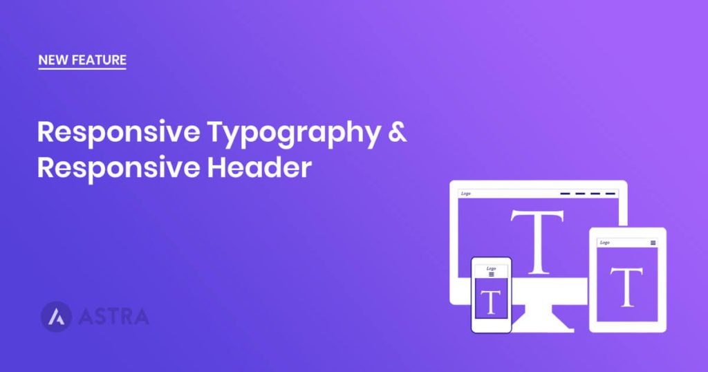
Clean and readable typography is important on mobile devices. Out of the box, Astra is amazingly responsive and designed with readability in mind. To take this further in version 1.0.4, we’re introducing options so website admin can customize the typography for different devices herself without touching a single line of code.
Here is a video I just recorded that will give you an idea –
Looks pretty useful, right?
Responsive Header Improvements
Next, for the 1.0.4 release: we’ve taken great efforts to make sure your website header will look stunning on small devices. We made changes not just to improve the design, but to improve the overall experience of your mobile visitors.
Some of the changes we have made –
- Provided a setting for custom label with the hamburger menu icon. (Screenshot)
- Choose your favorite header alignment on mobile devices. (GIF)
- Much better design and user experience. (GIF)
Other Misc Updates
- Improvement: Support for multiple widgets in header
- Fixed: Featured image permalink issue from blog page.
- Improvement: Updated primary submenu navigation icon.
- Improvement: Updated Small Devices menu navigation styling.
That’s about it for the v 1.0.4 of Astra. The update notification should be shortly available in your WordPress backend.
Please feel free to drop us your feedback or suggestion in the comments below!

Sujay Pawar is the co-founder and CEO of Brainstorm Force. He brings a one-of-a-kind fusion of tech brilliance, business savvy and marketing mojo to the table. Sujay has consistently spearheaded the development of innovative products like Astra, CartFlows, ZipWP and many others that have become market leaders in their respective niches.
Disclosure: This blog may contain affiliate links. If you make a purchase through one of these links, we may receive a small commission. Read disclosure. Rest assured that we only recommend products that we have personally used and believe will add value to our readers. Thanks for your support!


Hey Sujay,
My mobile menu still not responsive. It looks like a JavaScript issue or a capability issue.
Any suggestion on how to resolve this and have hamburger menu responsive.
Thank you,
Hello Carmen,
For Technical support, please reach out to us through our Support Portal – https://clone.wpastra.com/support/open-a-ticket/